
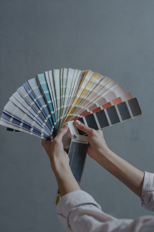
Creating a calm and peaceful environment in your home often starts with choosing the right colors. The colors you select can significantly influence the mood and ambiance of your space, helping you relax and recharge. If you’re planning to refresh your walls, furniture, or decor and want to promote tranquility, this guide offers helpful tips for choosing calm colors for your home.
Why Choose Calm Colors?
Calm colors are typically soft, muted, and soothing tones that encourage relaxation and reduce stress. Unlike bright or intense colors, calm colors help create spaces that feel serene and comfortable—perfect for areas like bedrooms, living rooms, or any space where you want to unwind.
Some popular calm colors include soft blues, gentle greens, warm neutrals, and light grays. Choosing these tones thoughtfully can enhance your home’s atmosphere and support your well-being.
Tips for Choosing Calm Colors
1. Consider the Purpose of the Room
Different rooms serve different functions, so think about how you plan to use the space. Calm colors work especially well in bedrooms, reading nooks, and bathrooms where relaxation is key. For example:
– Bedroom: Soft blues or pale lavenders promote tranquility.
– Living Room: Warm neutrals or gentle greens create welcoming environments.
– Bathroom: Light grays or aqua shades evoke cleanliness and calm.
Matching color choices to the room’s purpose can make your home more enjoyable and comfortable.
2. Look for Soft, Muted Shades
When choosing calm colors, aim for soft, muted shades rather than bold or bright versions. Muted colors have a bit of gray or white mixed in, which tones down their intensity and makes them easier on the eyes.
For example, instead of bright yellow, select a soft buttercream or beige-yellow. Instead of bold green, try sage or moss green. These subtler versions help create a peaceful vibe without overwhelming the senses.
3. Use a Neutral Base
Starting with a neutral base like off-white, beige, or soft gray can provide a versatile and calming backdrop. Neutral walls allow you to add color through furniture, textiles, and accessories without making the space feel busy or cluttered. They also help calm the overall look.
Neutrals are easy to pair with almost any calm color, offering flexibility if you want to change your accents in the future.
4. Test Colors in Different Lighting
Lighting can drastically change how a color looks in your home. Natural light, artificial light, and the time of day all affect paint and fabric colors.
Before committing to a color, test it on your walls or spaces at different times. Use paint samples or swatches to observe how the color changes from morning sunlight to evening lamps. This practice ensures you choose a calm color that maintains its soothing quality in various lighting conditions.
5. Create a Cohesive Color Palette
Choosing calm colors doesn’t mean you have to stick to just one shade. Creating a cohesive palette with a few complementary calm colors can add depth and interest to your space while maintaining peacefulness.
For example, pair soft blues with warm grays and off-white accents. Or combine muted greens with natural wood tones and beige elements. Using a palette helps prevent your home from feeling flat or monotonous while keeping the overall tone calm.
6. Incorporate Nature-Inspired Tones
Colors inspired by nature are inherently calming, as they bring a sense of the outdoors inside. Consider colors like sky blue, soft green, sandy beige, or stone gray. These colors evoke natural scenes such as forests, beaches, and skies, which can promote relaxation and a grounded feeling in your home.
Pairing these colors with plants and natural materials like wood or linen enhances the calming effect.
7. Avoid Overuse of Dark or Intense Colors
Dark or very intense colors can create a dramatic and cozy atmosphere but may not always be calming. If you want to use darker colors, balance them with plenty of light neutrals and soft accents.
Similarly, avoid using highly saturated or neon colors in large areas if your goal is to promote calm. Instead, reserve brighter colors for small accessories or feature pieces.
8. Think About Texture and Finish
Color is only one part of creating a calm space. The texture and finish of your materials also influence the room’s feel.
Matte or eggshell paint finishes diffuse light softly and contribute to a calming ambiance, while glossy finishes reflect more light and can feel less subdued.
Soft textiles like cotton, wool, or linen in calming colors add warmth and comfort, enhancing the peaceful mood.
Final Thoughts
Choosing calm colors for your home is a great way to foster relaxation and create inviting spaces. By considering room purposes, selecting muted tones, testing colors under different lighting, and building a cohesive palette, you can make thoughtful choices that refresh your home’s atmosphere.
Remember that your personal preferences matter most. Select colors that make you feel comfortable and happy, and your home will naturally become a peaceful retreat.
—
With these tips, you’re well on your way to choosing calm colors that help you enjoy a serene and welcoming home environment. Happy decorating!